For churches
Your look
Your church's look sets the colours, fonts and layout of the public gallery: the top bar, the welcome area, the cards, the buttons and the lettering. Each missionary's kiosk also has its own colours, set in its Kiosk design step.
Only admins and owners can change the look. Open Settings, choose Run setup again, and start at Your look.
Borrow your website's look #
- Type your church's website address, for example
www.yourchurch.org. - Press Use my website's look. Missionary Lane reads the public home page only.
- Check the preview. The colours and fonts come from your website. On the next screen, Church details, it also fills in the logo and other details it found.
- Change anything that's off, then press Save and continue.
When your site's styles make it clear, it also picks up layout choices such as a dark page, button shape, heading style, a tinted welcome photo and outlined cards. If the website can't be read, pick your colours yourself or start from one of the looks below.
The five starting looks #
Each look changes the layout as well as the colours and fonts. Your logo and church name stay the same. Picking a look replaces your colours, fonts and layout; you can still change each of them before you save.
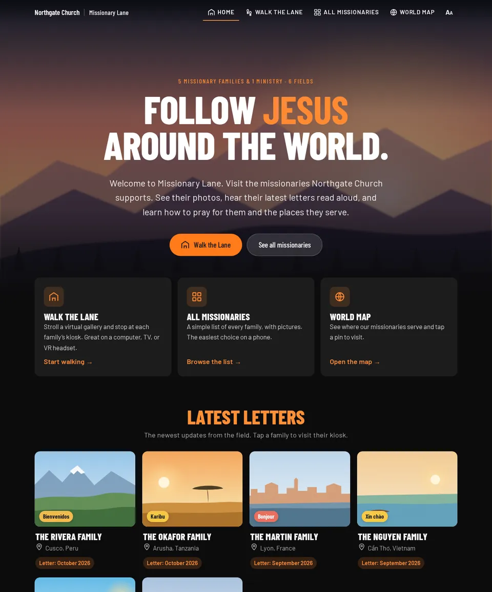
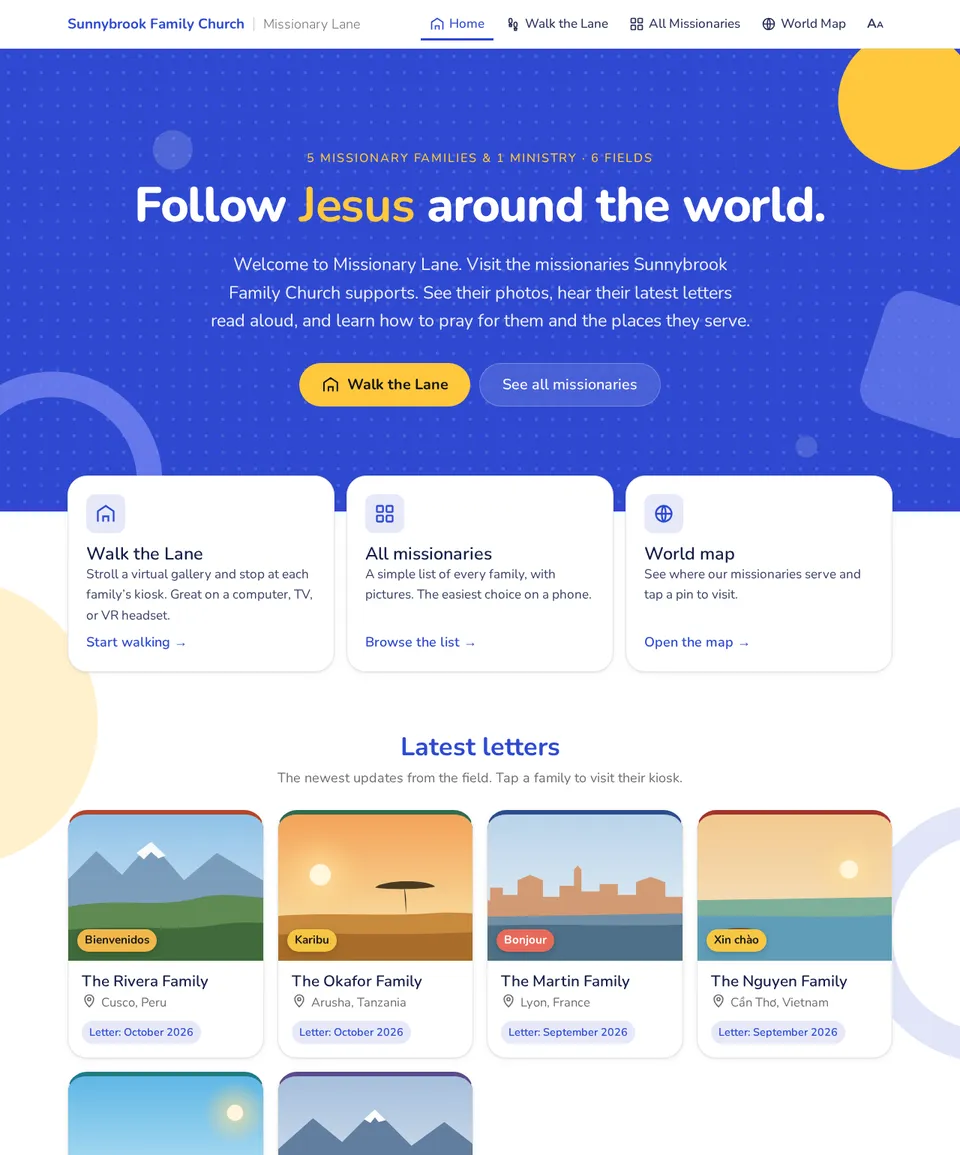
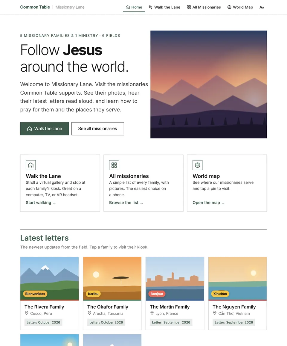
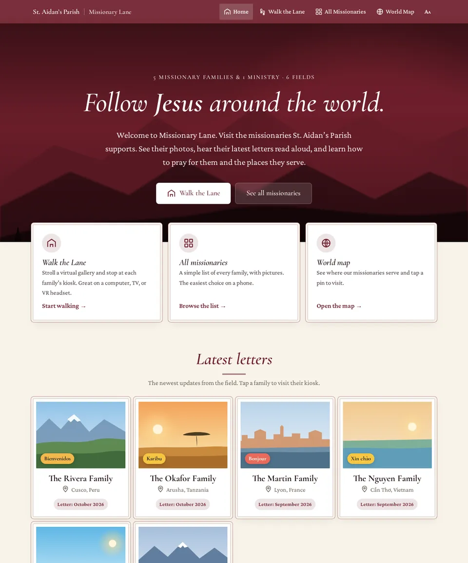
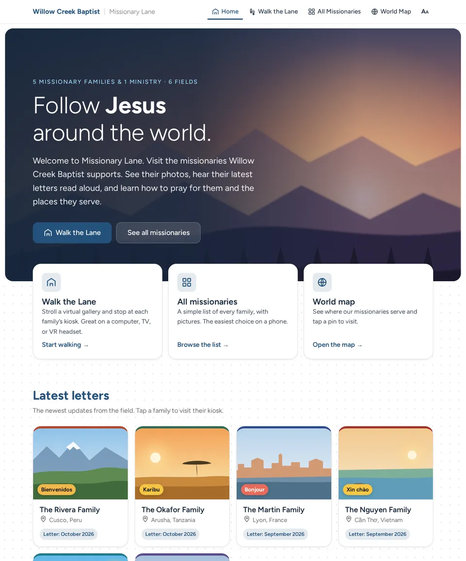
The churches in these screenshots are fictional.
Fine-tune it #
- Colours: main colour, bright colour, deep colour, accent on dark, heading text, body text, footer background and footer text. Each one says where it's used.
- Deep colour: used for links on white, so it must be easy to read, at a contrast of at least 4.5 to 1. If it isn't, press Fix it for me and it's darkened for you. You can't save until it passes.
- Fonts: a headline font and a text font, chosen from a list of Google Fonts or the fonts found on your website.
- Button corner roundness: 0 is square, 24 is very round.
- Layout: page background (light, warm or dark), top bar (solid, light or see-through over the welcome photo), welcome area (photo, tinted photo, colour block or words beside a photo), cards (raised, outline, flat or framed), button shape (rounded, pill or square), headings (normal, capitals or serif italic), background pattern (none, dots, shapes or grain) and text alignment (centred or left).
Press Save and continue to keep your changes. Skip — use the default look moves on without saving anything.
The admin pages use your church's colours and fonts but keep their own layout. Kiosk interiors keep their own palettes, set per kiosk.
Church details #
The next screen holds what appears in the gallery's header and footer:
- The church name (required), the logo, a footer logo and a small square icon. A wide logo with a see-through background works best. Logos and icons can be up to 5 MB.
- The welcome photo, which is resized for you, and a short welcome line.
- Links to your website, giving page and “Plan your visit” page, plus your street address and phone number.